6- Building the London Breadcrumb project (digital)
- 22 nov. 2023
- 3 min de lecture

In the initial stages of the London Breadcrumb Project, then named 'GET Lost,' I took the helm of choosing its branding. Recognizing the need for a digital element to enhance the connection between new residents and locals, I pivoted towards the creation of a website prototype. Inspired by the user interface and mapping features of Queering the Map, this digital component aimed to make the project tangible in the real world while fostering seamless connections between newcomers and established locals.
Seamless digital integration as catalyst for connection
The decision to introduce a digital component was driven by the desire to bridge the gap between new residents and locals, allowing for the easy sharing and accessibility of stories. The website became the linchpin, acting as a bridge and connecting users to a broader digital network. This not only added depth to the London Breadcrumb Project but also facilitated effortless connections between new residents and locals. Breaking down the user journey was simple for our local users: locals would reach the website, found and shared via the accessible leaflets present at GPs, libraries and halls. Our local would be taken to the onboarding screens explaining the project clearly, and then have the choice to record their story and send it to us (the moderators) for approval. Once approved, the story would be pinned onto the map present in the background of the screen. All pins represent a recorded story.


Low-fidelity prototypes of the website version of The London Breadcrumb Project.
Some of my high fidelity prototypes, recorded here, presented issues with seamless animation. The website also needed to be updated to the new project name, initially known as Get Lost.
Visual Identity
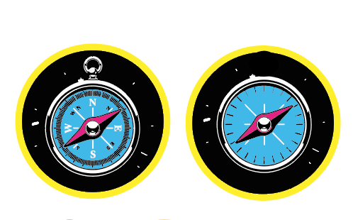
Drawing inspiration from road signs and the graceful flight patterns of bees, the choice of yellow and black as the brand colors was deliberate. These colours were not merely a visual aesthetic; they represented a bold and youthful energy, echoing the essence of the project. The hexagonal shape of the compass further distinguished it from conventional designs, boldly indicating the direction to the nearest sticker, a unique feature that encapsulated the project's visual freshness and brightness.
In the realm of typography, the emphasis was on selecting a typeface that exuded novelty and boldness, aligning with the youthful spirit of the project. This choice extended to graphic elements in leaflets, websites, and stickers. Every visual component was meticulously crafted to grab attention, a crucial element identified during user testing, where the exposure of the compass in key locations across London became paramount.
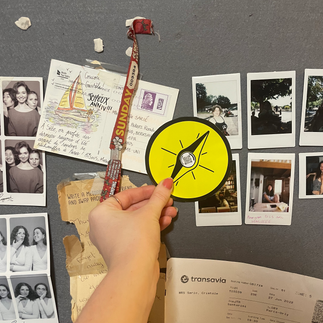
The creation of the stickers needed to also be extremely recognisable and user friendly. I tested these in various locations and the colour was, as I have found following testing, the right choice. The establishment of the logo also became significant as well. The process of simplifying the logo for it to (almost) look like a wayfinding signage, appropriate for the project's theme.

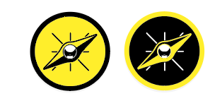
Progression and development of the `RFID sticker and logo.


Progression, development and testing of the `RFID stickers and logo.
In my personal assessment, the visual identity of the project proved to be as valuable as the technical prowess involved in crafting the compass. The connection between graphic elements and the physicality of the compass underscored their mutual dependence. Without the well-thought-out graphic components, the compass would lose its efficacy in the real-world setting, diminishing the overall impact of the project.
Navigating Challenges: Graphic Communication in Project Evaluation
The apparent disparity in the perceived value of graphic communication, compared to the physical computing side, prompted a deeper exploration of this dynamic. On a project of such significance, where the digital and physical realms intertwine, it became evident that both aspects are indispensable. The visual identity not only enhances the aesthetic appeal but also serves as a conduit for the project's functionality in real-world scenarios.
I had found at this stage of the project that striking a balance between the visual identity and technical aspects became imperative. A harmonious integration of computing, making, and graphic communication emerged as the key to the project's success, reinforcing the notion that these elements are interwoven threads in the fabric of effective design.
In navigating the challenges of project evaluation and refining the London Breadcrumb Project, the journey unveiled the intrinsic value of a well-crafted visual identity. The fusion of computing expertise and graphic finesse is not merely complementary; it is the symbiotic force propelling the project towards its ultimate goal – seamlessly guiding new residents through the rich tapestry of London.


Commentaires